Headers
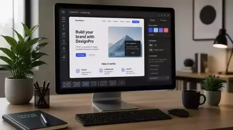
This is where your brand logo and navigation menu reside, setting the tone for the entire site.
Join Elena Rivers' community for beginner-friendly tutorials, design tips, and free resources to build your stunning website.
Posted on: 2026-04-15
By: Elena Rivers
Did you know that a well-structured website layout can significantly enhance user experience and engagement? Understanding how headers, footers, and navigation menus work together is essential for creating a site that not only looks good but also functions effectively.
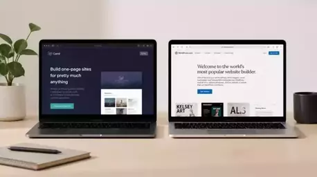
Understanding the critical components of a website layout can significantly enhance user experience. Below is a side-by-side comparison of the essential elements:
This is where your brand logo and navigation menu reside, setting the tone for the entire site.
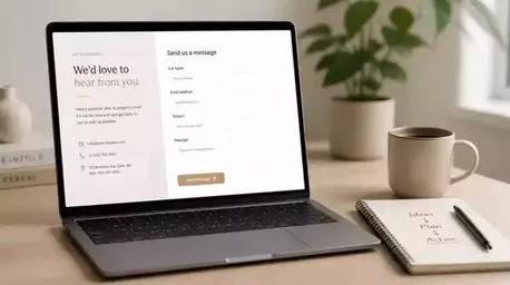
Often overlooked, footers carry important information and links that enhance usability.
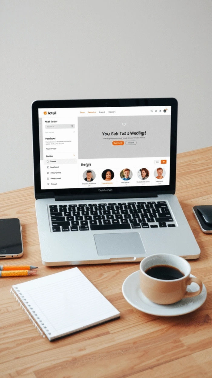
These guide visitors through your site, helping them discover content effortlessly.
Design all elements to be mobile-friendly, ensuring a consistent experience across devices.
Creating a website can feel like piecing together a puzzle, but understanding the importance of layouts is a crucial part of the process. Headers, footers, and navigation menus serve as the backbone of any website. They guide users through your content, ensuring they find what they are looking for easily and efficiently. As someone passionate about web design, I can't stress enough how a well-structured layout can enhance user experience (UX) and keep visitors engaged! For more in-depth guidance, check out our essential website design tips for beginners.
When I started Website Design Free, I quickly learned that a website's layout isn't just about looks; it's about functionality. A clean and intuitive design helps visitors navigate with ease, making them more likely to stay on your site and explore. So, let's dive into why customizing layouts is essential!
Customizing your website layout can significantly impact your visitors' experience. Here are a few reasons why:
By focusing on these elements, you can create an environment that not only looks good but feels right for your audience. Remember, a well-thought-out layout can leave a lasting impression!
There are several key elements to keep in mind when designing your website layout:
Each of these components plays a vital role in ensuring that users have a smooth and enjoyable experience on your site. As I’ve guided many beginners through this process, I can assure you that mastering these elements will lead to a more professional appearance and increased user satisfaction. Discover more about building intuitive menus and flows for your website.
When it comes to layout customization, understanding visual design principles can help you create a more cohesive and aesthetically pleasing site. Here are some principles to consider:
By applying these design principles, you can transform an ordinary layout into something extraordinary. Trust me, when users feel comfortable navigating your site, they're more likely to return. So, embrace these tips as you dive into your website creation journey!
Did you know? A/B testing your website layout can provide valuable insights into user preferences. By creating two versions of a page with slight variations—such as different menu placements or color schemes—you can analyze which layout leads to better engagement and user retention. This data-driven approach ensures that your design decisions are backed by real user feedback, ultimately enhancing the overall user experience!
As we wrap up our journey on customizing website layouts, it’s essential to acknowledge the significant role headers, footers, and navigation menus play in user experience. By effectively designing these elements, you can greatly enhance how visitors interact with your site. Remember, a well-structured layout not only guides users but also reflects your brand's identity!
To summarize, here are some key aspects to keep in mind when customizing your website layout:
By keeping these points in mind, you’ll be better equipped to create a seamless experience for your visitors, leading to increased engagement and satisfaction.
To help you streamline the layout customization process, let’s highlight some takeaways that can guide your efforts. When customizing headers, footers, and menus, consider the following:
These takeaways will not only enhance your website’s usability but will also promote a positive user experience that keeps visitors coming back for more!
Now that you’re equipped with the knowledge to customize your website layout effectively, it’s time to take action! Here are the next steps to implement your custom layout:
Taking these steps will help you transition from planning to execution. Remember, I’m here to support you throughout this process, so feel free to reach out with any questions you may have!
Creating a website is just the beginning; engaging with your audience is crucial for ongoing success. Gathering feedback and encouraging interaction can significantly improve your website’s usability and overall effectiveness.
Let’s explore some ways to engage with your audience and foster a community around your site!
User feedback is a goldmine for understanding how your website is performing. Here are some strategies to collect and utilize feedback:
By actively seeking feedback, you’ll be able to make informed decisions that enhance user experience and meet your audience’s needs!
To foster a community, it’s important to encourage interaction on your website. Here are some suggestions:
These practices will keep your audience engaged and create a vibrant community around your brand!
Finally, conducting user research is essential for ongoing improvement. Consider the following methods:
By prioritizing user research, you’ll be able to continuously refine your website, ensuring it remains user-friendly and effective in meeting your audience’s needs.
Here is a quick recap of the important points discussed in the article:

