Consistency
A grid system provides a uniform structure that keeps your design cohesive.
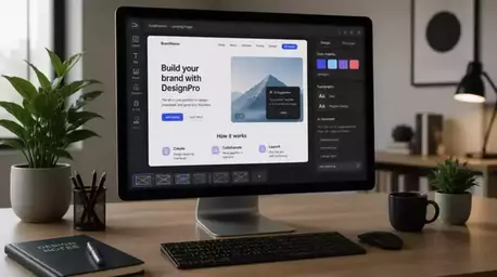
Join Elena Rivers' community for beginner-friendly tutorials, design tips, and free resources to build your stunning website.
Posted on: 2026-03-19
By: Elena Rivers
The world of web design opens up a universe of possibilities, yet many beginners feel overwhelmed by complex layouts. In fact, a staggering 70% of users abandon websites due to poor design. Understanding grid systems can be the key to transforming your site from cluttered to cohesive.
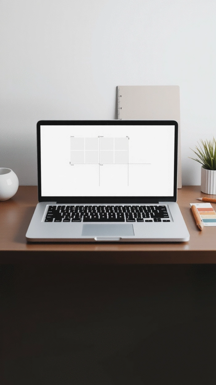
Grid systems are essential for creating organized and responsive designs. Below are the primary benefits illustrated visually.
A grid system provides a uniform structure that keeps your design cohesive.
Grids allow for various designs and adaptations based on screen size and user needs.
Using grids can speed up the design process, as you can easily align elements.
Visitors can easily navigate your site, regardless of their device.
Search engines favor mobile-friendly websites, boosting your visibility.
When diving into the world of web design, one concept you’ll hear about often is grid systems. But what exactly are they? Grid systems are a framework for organizing content on your website, enabling a consistent and structured layout that adapts to different screen sizes. Understanding how these systems work can significantly improve your website's usability and aesthetics, making them a crucial component in modern web design.
In this section, we’ll explore the importance of grid systems, especially when it comes to creating responsive layouts. A well-implemented grid not only makes your site visually appealing but also enhances the user experience across various devices. Let's get into why they matter!
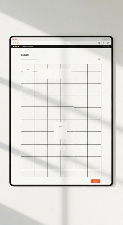
At its core, a grid system divides your page into a series of rows and columns, allowing you to position elements precisely and consistently. Think of it like a blueprint for your layout! Here are a few reasons why grid systems are essential:
By using grid systems, you can ensure that every element has its rightful place, making your website look organized and professional. This is especially beneficial for beginners who may find layout design daunting!
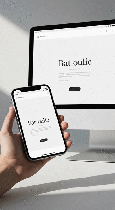
In today’s digital age, users access websites on a myriad of devices, from smartphones to large desktop monitors. This diverse landscape makes responsive design a must-have! A responsive layout adapts to various screen sizes, ensuring that your content is always accessible and looks great.
Here are some key benefits of implementing responsive layouts:
As a web designer, understanding the significance of responsive layouts will empower you to create engaging experiences for your users. It’s all about meeting them where they are!
To create truly responsive designs, it’s essential to grasp two critical concepts: fluid grids and breakpoints. Fluid grids use relative units (like percentages) instead of fixed units (like pixels), allowing your layout to scale smoothly with the viewport size. This adaptability is key in modern web design.
Breakpoints come into play to help you define specific points where your layout will change, ensuring that it fits neatly on various devices. Here’s a quick overview:
Understanding these principles will help you design websites that are not only beautiful but also functional across all devices. By utilizing fluid grids and strategic breakpoints, you’ll set the stage for a seamless user experience that looks good on any screen!
As you explore the world of grid systems and responsive design, we’d love to know: What challenges have you faced while implementing these concepts in your projects? Share your thoughts below:
As we conclude our exploration of CSS Grid Systems, it's vital to reflect on the key aspects that make responsive web design a game changer for beginners and seasoned designers alike. Understanding how to implement grid systems effectively can transform your approach to creating websites. Not only does it enhance the visual appeal of your site, but it also ensures a seamless user experience across devices.
Here are some key takeaways to consider as you wrap up your journey with CSS Grid:
Now that you have a solid foundation in CSS Grid, you might be wondering about your next steps. Luckily, there are plenty of resources and tools to deepen your understanding and help you practice what you've learned. Here’s a list of recommendations for further learning:
Continuing your education will not only boost your skills but also enhance your confidence as you tackle more complex designs! For those looking to build their first site, our beginner's guide to building a website offers a great starting point.
A: A grid system in web design is a framework that divides a webpage into a series of rows and columns. It helps organize content consistently and precisely, providing a structured layout that adapts to different screen sizes and improves overall aesthetics and usability.
A: Responsive web design is crucial because users access websites on a wide range of devices, from smartphones to desktop monitors. A responsive layout ensures that your website content is always accessible and visually appealing, regardless of the screen size, leading to improved user experience, better SEO, and cost-effectiveness compared to maintaining separate site versions.
A: Fluid grids use relative units (like percentages) to allow elements to resize proportionally with the screen, maintaining design integrity. Breakpoints are defined widths at which a website's layout will adjust to fit different screen sizes, ensuring optimal viewing on various devices.
A: CSS Grid offers advanced features such as auto-fit and grid template areas, which provide significant flexibility in designing complex layouts. It allows designers to create more dynamic and adaptable structures for their content, making it easier to arrange elements precisely and efficiently across responsive designs.
A: Tools like Google Analytics can track user behavior and identify areas for improvement. Hotjar provides heatmaps to visualize user navigation and gather feedback. Optimizely allows you to run A/B tests to compare different layouts and design features, helping optimize conversion rates.
One of the best aspects of web design is the vibrant community that surrounds it. Engaging with others can provide insights, inspiration, and constructive feedback as you refine your skills. Plus, sharing your work can help you build a portfolio that showcases your CSS Grid expertise.
Creating a portfolio is an essential step in your web design journey. Not only does it display your skills, but it also allows potential clients or employers to see your design style and proficiency with CSS Grid. Here are a few tips for building an impactful portfolio:
The world of web design is always evolving, and staying updated on the latest trends is crucial! Following industry leaders and design blogs will keep your knowledge fresh and inspire your creativity. Consider subscribing to newsletters or joining online forums to engage with other designers. To ensure your website remains modern and user-friendly, consider how to build a mobile-responsive website effectively.
Finally, as you implement your beautiful new designs, don’t forget to measure their effectiveness! Utilizing analytics tools can help you understand how users interact with your site. Here’s a quick list of tools that can assist with Conversion Rate Optimization:
By staying engaged with the community, refining your portfolio, and utilizing analytics, you’ll not only enhance your skills but also foster a deeper understanding of user needs and preferences! For further reading on improving your site's performance, check out these SEO tips for website builders.
Here is a quick recap of the important points discussed in the article:

