Building a Mobile-Responsive Website

Posted on: 2025-08-21
By: Elena Rivers
With over half of all web traffic coming from mobile devices, creating a mobile-responsive website isn't just an option—it's a necessity. Are you ready to enhance your design skills and ensure your site is accessible to all users? Let's explore the essential takeaways that will empower your mobile design journey.
What You Will Learn
- Understanding the importance of mobile-responsive design for user experience and SEO performance.
- Benefits of adopting a mobile-first approach, including improved navigation and site load times.
- Key steps for creating effective mobile designs, such as establishing content priorities and configuring the viewport.
- Utilizing media queries and responsive images to ensure a seamless browsing experience across devices.
- Identifying and overcoming common challenges associated with mobile design to enhance usability.
- Incorporating accessibility features to make your mobile site usable for everyone, regardless of ability.
- Staying updated with emerging trends in mobile-responsive design to keep your site relevant.
Best Practices for Mobile-Responsive Design
Key points crucial for creating a successful website.
Prioritize Content
Identify what information is most important for mobile users.
Set Up Your Viewport
Ensure your viewport is configured correctly for various devices.
Use Media Queries
Implement media queries to adjust styles based on screen size.
Optimize Images
Make sure images load quickly and adapt to different screen sizes.
Test Across Devices
Regularly test your design on different devices and browsers.
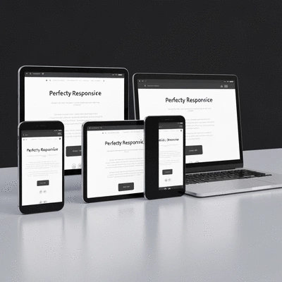
A Hands-On Guide to Mobile-First Responsive Design
In today’s digital landscape, having a website that looks great on mobile devices is more important than ever. Mobile-responsive design ensures that your website adapts seamlessly to different screen sizes, providing an optimal viewing experience for users on smartphones and tablets. With more than half of all web traffic coming from mobile devices, ignoring this aspect can lead to lost visitors and potential customers! If you're looking for more general advice on creating a strong online presence, consider these essential website design tips for beginners.
At Website Design Free, I see many new designers struggle with mobile design. That's why it's essential to grasp the concept of responsive design early on. It not only enhances usability but also plays a significant role in your site’s search engine ranking. Google prioritizes mobile-friendly sites, making this a crucial factor in your web creation journey.

Understanding Mobile-Responsive Design
Mobile-responsive design is all about creating websites that provide an enjoyable browsing experience across various devices. This means your website’s layout, images, and functionalities adjust according to the screen size, ensuring that users have access to the same content regardless of the device they are using.
- Improved user experience
- Reduction in bounce rates
- Better SEO rankings
- Increased conversion rates
When you implement mobile-responsive design principles, you’re essentially enhancing accessibility for all users. This truly democratizes your content, allowing anyone to view your site as intended, whether they are on a desktop at home or a mobile device on the go. For those just starting out, learning how to build a website effectively is foundational.
Why Choose a Mobile-First Approach?
Starting your design projects with a mobile-first approach means prioritizing mobile users in your initial designs. This focus leads to numerous benefits, not just for your audience but also for you as the designer.
- Enhances overall user experience, making navigation simple and intuitive.
- Encourages streamlined content, ensuring essential information is presented first.
- Improves site load times, as mobile users often access sites on slower connections.
- Boosts your SEO rankings, as search engines favor mobile-friendly websites.
By thinking mobile-first, you’re not just responding to trends; you’re positioning your website to meet the real-world needs of your users. This proactive approach simplifies later adjustments for larger screens, so you can create a cohesive design that works across all devices!
Step-by-Step Process for Creating a Mobile-Responsive Website Design
Step 1: Establish Your Content Priorities
The first step in creating a mobile-responsive design is to identify your content priorities. What information is crucial for your users? Start by analyzing your existing content and determining what needs to be front and center on mobile devices.
- Identify core messages and key features.
- Highlight essential calls to action.
- Consider user journeys and common tasks they need to accomplish.
This exercise helps in structuring your mobile layout effectively, ensuring that users can quickly find what they need without overwhelming them with too much information.
Step 2: Setting Up Your Viewport
Next, let’s talk about viewport settings. A viewport is the user’s visible area of a web page, and properly setting it is crucial for responsive design.
- Use the
<meta name="viewport">tag to control layout on mobile browsers. - Set
width=device-widthto ensure the page scales according to the device's width. - Include
initial-scale=1.0for consistent scaling across devices.
By configuring your viewport correctly, your website will automatically adjust its layout based on the viewer's device, creating a smoother experience.
Step 3: Implementing Media Queries for Flexibility
Media queries are the backbone of responsive design, allowing you to apply different styles depending on the device characteristics. Here’s how to use them effectively:
- Define breakpoints based on common screen sizes (e.g., mobile, tablet, and desktop).
- Use the
@mediarule to apply styles conditionally. - Test your styles to ensure they look great at each breakpoint.
By mastering media queries, you’ll gain control over how your site looks on various devices, making adjustments as necessary to enhance the user experience.
Step 4: Optimizing Images and Media for Mobile
Images and media can significantly impact your website’s loading time, especially on mobile devices. Here are best practices to consider:
- Use responsive images with the
srcsetattribute to serve appropriate sizes. - Implement lazy loading techniques to improve initial load times.
- Compress images without sacrificing quality to reduce file sizes.
By optimizing your media, you ensure fast loading times and a seamless experience for users, making it easier for them to engage with your content.
Step 5: Leveraging Design Tools and Software
To simplify the process of creating mobile-responsive designs, consider using design tools like:
- Elementor: A powerful drag-and-drop page builder for WordPress.
- Figma: Excellent for collaborative design work and prototyping.
- Adobe XD: Ideal for designing and prototyping user experiences.
These tools can help streamline your design process, allowing you to create stunning, responsive layouts without extensive coding knowledge.
Step 6: Testing Your Mobile-Responsive Design
Testing your design across various devices and browsers is crucial to ensure a fully responsive experience. Here are some tips:
- Use browser developer tools to simulate different screen sizes.
- Test on actual devices whenever possible to check usability.
- Pay attention to performance metrics such as loading speed.
Thorough testing helps identify any inconsistencies in your design, allowing you to make necessary adjustments before your site goes live.
Common Challenges in Mobile-Responsive Design
Creating mobile-responsive designs can come with its challenges. Some common obstacles include:
- Dealing with varying screen sizes and resolutions.
- Balancing aesthetics with functionality.
- Ensuring all elements remain accessible and user-friendly.
By being aware of these challenges, you can proactively address them, ensuring a smoother design process and better end results!
Advanced Customization Techniques for Unique Designs
For those looking to elevate their responsive designs, consider exploring advanced CSS and JavaScript techniques. Frameworks like Bootstrap and Flexbox can provide additional flexibility:
- Bootstrap: A front-end framework that simplifies responsive design.
- Flexbox: A layout model that allows for more complex arrangements.
By mastering these tools, you can create unique and visually appealing designs that stand out while remaining functional. For those working with WordPress, a deeper dive into WordPress guides for new users can offer valuable insights into customization within that environment.
Incorporating Accessibility in Responsive Design
Accessibility is key when it comes to designing mobile-responsive websites. Here are some strategies to ensure your site is usable for everyone:
- Incorporate touch-friendly navigation menus.
- Ensure text is legible with appropriate contrast and font sizes.
- Test with assistive technologies to identify potential barriers.
By prioritizing accessibility, you create a more inclusive web experience, allowing all users to engage with your content effectively.
Emerging Trends in Mobile-Responsive Design
The field of mobile-responsive design is ever-evolving. Some emerging trends to keep an eye on include:
- Integration of AI and machine learning for personalized experiences.
- Utilization of performance optimization strategies to enhance loading times.
- Increased focus on voice user interfaces and natural language processing.
Staying informed about these trends will not only help you keep your designs fresh but will also ensure you’re meeting the needs of future users!
Pro Tip
Did you know? A well-optimized mobile site can load up to 85% faster when images are compressed and properly sized for different devices. This not only enhances user experience but also positively impacts your SEO rankings. Always prioritize image optimization as part of your mobile design strategy!
Frequently Asked Questions About Mobile-Responsive Design
Why is mobile-responsive design crucial today?
With over half of all web traffic coming from mobile devices, a mobile-responsive design ensures your website is accessible to all users, provides an optimal viewing experience, improves user experience, and boosts your search engine rankings.
What is a "mobile-first" approach?
A mobile-first approach means prioritizing mobile users in your initial design process. This strategy helps streamline content, improves site load times, and enhances overall user experience, often simplifying adjustments for larger screens later.
How do media queries help in responsive design?
Media queries are essential for responsive design as they allow you to apply different CSS styles based on device characteristics like screen size, resolution, and orientation. This enables your website to adapt its layout and appearance to various devices.
What are the key steps to creating a mobile-responsive website?
The key steps include establishing content priorities, setting up your viewport, implementing media queries, optimizing images and media, leveraging design tools, and thoroughly testing your design across various devices.
Why is optimizing images important for mobile sites?
Optimizing images is crucial because large image files can significantly slow down your website's loading time, especially on mobile devices with slower connections. Properly optimized images improve user experience, reduce bounce rates, and positively impact SEO.
Summarizing Best Practices for Mobile-Responsive Design
As we wrap up our discussion on mobile-responsive design, let’s recap the key points that are crucial for creating a successful website. Adopting a mobile-first approach not only enhances user experience but also aligns with SEO best practices, which ultimately drives more traffic to your site. Here’s a quick list of best practices you should keep in mind:
- Prioritize Content: Identify what information is most important for mobile users.
- Set Up Your Viewport: Ensure your viewport is configured correctly for various devices.
- Use Media Queries: Implement media queries to adjust styles based on screen size.
- Optimize Images: Make sure images load quickly and adapt to different screen sizes.
- Test Across Devices: Regularly test your design on different devices and browsers.
By focusing on these best practices, you'll create a website that not only looks great but also performs well across all devices. Remember, in today’s digital age, a mobile-first design is not just a nice-to-have; it’s essential!
Take Action with Your Mobile Design Strategy
Now that you have the knowledge and tools to build a mobile-responsive website, it's time to put your plan into action! I encourage you to start implementing the steps we've outlined. Whether you're working on your first blog or a small business site, each small change can lead to significant improvements in user experience.
If you feel stuck or have questions as you dive into your mobile design strategy, don’t hesitate to reach out. I’m here to help! Share your experiences in the comments below or check out some of our resources at Website Design Free for additional guidance. Together, let's create something amazing that resonates with your audience!
Recap of Key Points
Here is a quick recap of the important points discussed in the article:
- Prioritize Content: Identify what information is most important for mobile users.
- Set Up Your Viewport: Ensure your viewport is configured correctly for various devices.
- Use Media Queries: Implement media queries to adjust styles based on screen size.
- Optimize Images: Make sure images load quickly and adapt to different screen sizes.
- Test Across Devices: Regularly test your design on different devices and browsers.
 Choosing the right platform for your one-page website can feel overwhelming, especially with options
 Have you ever encountered a website that felt unapproachable or unfriendly? A well-designed contact
 Artificial Intelligence is revolutionizing the way we approach web design, making the process not on
