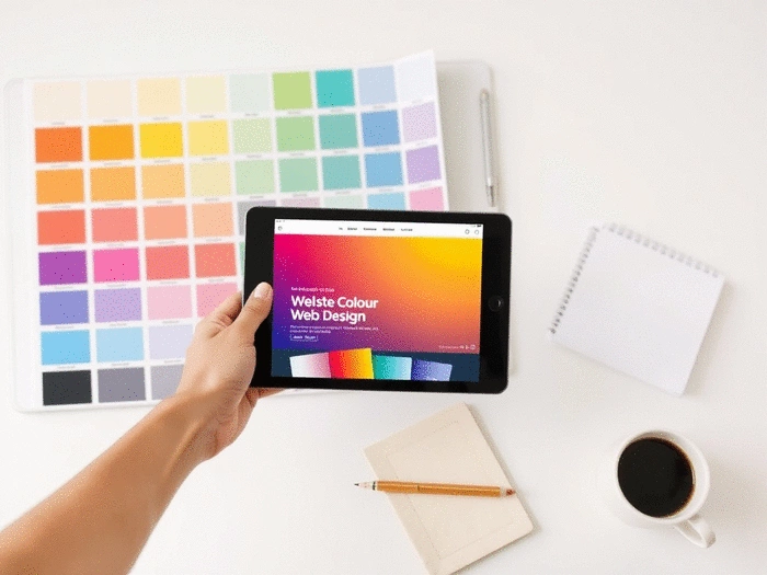
Understanding Color in Web Design
Posted on: 2025-09-07
By: Elena Rivers
Are you aware that colors can influence not just how your website looks, but also how visitors feel and behave? Understanding color psychology is more than just a design choice—it's a strategic decision that can significantly impact your website's effectiveness.
What You Will Learn
- Color psychology plays a vital role in shaping user perceptions and emotions.
- Different colors evoke distinct emotions: blue conveys trust, while red creates urgency.
- Establish a strong brand identity through a well-thought-out color palette.
- Utilize the 60-30-10 rule to ensure balance and harmony in your designs.
- Accessibility should be a priority—test color choices to accommodate all users.
- Experiment and iterate on your color strategies based on user feedback for continuous improvement.
Color Associations and Their Impact on User Behavior
Explore how different colors can evoke emotions and influence actions in web design.
Red
Often associated with excitement and urgency.
Blue
Conveys trust and professionalism.
Green
Represents growth and tranquility.
Yellow
Evokes optimism and cheerfulness.
Purple
Suggests creativity and luxury.
Understanding the Impact of Color Psychology in Web Design
When it comes to creating a website, understanding color psychology is crucial. Why? Because the colors you choose can influence how visitors feel about your brand, ultimately affecting their decision to stay or leave. As a web designer and educator, I've seen firsthand how a thoughtful approach to color can transform a website from ordinary to extraordinary. Let’s dive into what color psychology is and why it matters for your web design!
Color psychology refers to the study of how colors affect perceptions and behaviors. Different colors evoke different emotions; for instance, blue often conveys trust and reliability, while red can inspire urgency and excitement. By harnessing these psychological effects, you can create a more engaging user experience that resonates with your audience. I always encourage beginners to consider not just aesthetics but also the emotional impact their color choices can have. For more foundational knowledge, explore these essential website design tips for beginners.

What is Color Psychology and Why Does it Matter?
Have you ever visited a website and immediately felt drawn to it or, conversely, found it off-putting? That reaction often stems from the color choices made by the designer. Understanding the principles of color psychology helps you align your website’s visual identity with the emotions and actions you want to inspire in your visitors.
- Establishes brand identity: Your color palette creates an immediate impression of your brand.
- Influences emotions: Colors can evoke feelings that may lead to specific actions, such as signing up for a newsletter or making a purchase.
- Affects usability: Thoughtful color choices improve readability and navigation, enhancing the overall user experience.
By incorporating these elements into your web design, you can effectively communicate your brand message and values. This is something I emphasize in my tutorials at Website Design Free, guiding users to make informed choices on color usage.
How Colors Influence User Behavior and Emotions
Colors can significantly influence user behavior and emotions, often in ways we may not consciously recognize. For example, warm colors like red and orange can create a sense of urgency, making them fantastic for call-to-action buttons, while cool colors like blue and green tend to promote calmness and trust. This understanding is vital for anyone looking to create a welcoming and effective website. If you're just starting out, our beginner's guide to building a website can provide a solid foundation.
- Red: Often associated with excitement and urgency.
- Blue: Conveys trust and professionalism.
- Green: Represents growth and tranquility.
- Yellow: Evokes optimism and cheerfulness.
- Purple: Suggests creativity and luxury.
By recognizing these associations, you can create a website that speaks to your users on a deeper emotional level. Remember, as you design, think about the feelings you want to evoke and choose your colors accordingly. I encourage you to experiment with different palettes in your projects at Website Design Free—it's all part of the learning process!
Interactive Poll: Your Thoughts on Color Choices!
We've discussed the powerful influence of colors in web design, but now we want to hear from you! What color do you think has the most significant impact on user engagement? Select your choice below:
Summarizing Effective Color Strategies for Your Website
As we wrap up our exploration of color psychology in web design, it's essential to highlight the key strategies that will elevate your site's visual appeal and effectiveness. Understanding how colors influence emotions and behaviors can truly transform your website into a more engaging and welcoming space for visitors. Here are the main takeaways to keep in mind:
- Color choice matters: Select colors that align with your brand identity and resonate with your audience.
- Balance is key: Use the 60-30-10 rule to create harmony in your color palette.
- Accessibility is crucial: Ensure your color choices accommodate all users, including those with color blindness.
- Test and iterate: Continuously improve your color strategy through A/B testing and user feedback.
By implementing these strategies, you can create a website that not only looks great but also serves as an effective tool for communication and engagement. Remember, the right colors can encourage visitors to stay longer and interact more with your content!
Encouraging Action: Optimizing Your Site with Color Psychology
Steps to Choose Your Ideal Color Palette Today
Are you ready to dive into selecting the perfect color palette for your website? Here’s a simple, actionable approach to guide you:
- Identify your brand’s personality: Consider the emotions you want your brand to evoke.
- Research color meanings: Look up how different colors are perceived to find the best fit.
- Experiment with combinations: Use tools like Adobe Color to visualize your palette.
- Test with your audience: Seek feedback on your color choices to ensure they resonate.
Following these steps can help you create a color palette that reflects your brand and connects with your audience effectively. I always encourage my students to take their time during this process—your website’s vibe hinges on these initial decisions!
Leveraging Color Schemes to Enhance Site Engagement
Once you’ve selected your color palette, it’s time to leverage it for maximum impact on user engagement. Here are some strategies to consider:
- Use contrasting colors: Improve readability and draw attention to key areas like calls-to-action.
- Highlight important information: Utilize accent colors to make vital points stand out.
- Be consistent: Maintain your color scheme throughout all site elements for a cohesive look.
These techniques not only enhance the aesthetic appeal of your site, but they also guide users through a smooth and enjoyable browsing experience. Color can be a powerful ally in encouraging action! For those interested in understanding different platforms, a simple comparison of website builders can help you choose the right tool for your design.
Additional Resources for Continuous Improvement in Web Design
As you continue your journey in web design, it’s important to keep honing your skills and knowledge. Here are some fantastic resources I recommend for ongoing improvement:
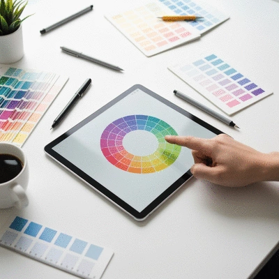
- Canva’s Color Wheel - A great tool for experimenting with color combinations.
- ColorHexa - Provides detailed information about colors, including shades and palettes.
- WebAIM Contrast Checker - Ensures your color choices meet accessibility standards.
- Smashing Magazine - Offers a wealth of articles and insights on color psychology and web design.
By exploring these resources, you can enhance your design skills and stay updated on the latest trends. So, don’t hesitate—take action today! Start experimenting with colors that reflect your unique brand identity and watch your website flourish!
Frequently Asked Questions About Color Psychology in Web Design
What is color psychology in web design?
Color psychology in web design is the study of how different colors influence user perceptions, emotions, and behaviors on a website. It involves selecting colors that align with brand identity and evoke desired responses from visitors, such as trust, urgency, or calmness.
How do specific colors impact user behavior?
Different colors have distinct psychological associations: Red often signifies excitement and urgency; Blue conveys trust and professionalism; Green represents growth and tranquility; Yellow evokes optimism and cheerfulness; and Purple suggests creativity and luxury. Using these associations strategically can guide user actions and emotional responses.
Why is establishing brand identity through color important?
Your color palette creates an immediate and lasting impression of your brand. Consistent and thoughtful color choices help reinforce brand values, make your website memorable, and build a strong visual identity that resonates with your target audience.
What is the 60-30-10 rule in web design?
The 60-30-10 rule is a design principle used to achieve balance and harmony in a color palette. It suggests using a dominant color for 60% of the design, a secondary color for 30%, and an accent color for 10%. This ratio helps create visual appeal without overwhelming the user.
How does accessibility relate to color choices in web design?
Accessibility in web design means ensuring that your website is usable by everyone, including individuals with disabilities like color blindness. This involves testing color combinations for sufficient contrast to ensure readability and usability for all users, adhering to standards like WCAG guidelines.
Why is it important to test and iterate color strategies?
User preferences and cultural interpretations of colors can vary. Testing (e.g., A/B testing) and iterating on your color strategies based on user feedback allows you to refine your palette for optimal impact, ensuring your choices effectively engage your specific audience and achieve your website's goals.
Recap of Key Points
Here is a quick recap of the important points discussed in the article:
- Color choice matters: Select colors that align with your brand identity and resonate with your audience.
- Balance is key: Use the 60-30-10 rule to create harmony in your color palette.
- Accessibility is crucial: Ensure your color choices accommodate all users, including those with color blindness.
- Test and iterate: Continuously improve your color strategy through A/B testing and user feedback.
- Emotional impact: Understand how different colors evoke emotions to enhance user experience.
 Choosing the right platform for your one-page website can feel overwhelming, especially with options
 Have you ever encountered a website that felt unapproachable or unfriendly? A well-designed contact
 Artificial Intelligence is revolutionizing the way we approach web design, making the process not on
