

Size and Scale
Larger elements often attract more attention and guide user focus effectively.
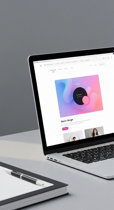
Join Elena Rivers' community for beginner-friendly tutorials, design tips, and free resources to build your stunning website.
Posted on: 2026-01-13
By: Elena Rivers
Would you like to elevate your web design skills and create a user-friendly website that captures attention? Understanding visual hierarchy can be your best asset. This essential concept not only improves aesthetics but also guides user behavior effectively. Let's explore the key takeaways that can transform your design approach!
Key concepts that significantly improve website design effectiveness are outlined below. For those just starting out, learning these principles is as crucial as understanding essential website design tips for beginners.
Larger elements often attract more attention and guide user focus effectively.
Use variations in color and brightness to highlight important information.
Strategic use of color can evoke emotions and guide users through the content.
Different font styles and sizes indicate importance and enhance readability.
Ample white space creates clarity and focus within the layout.
Related items should be grouped together to provide context and coherence.
Visual hierarchy is an essential concept in web design that dictates how elements on a page are arranged to influence user behavior. It helps guide visitors through your content, making it easier for them to find information and engage with your website. When done right, a well-structured visual hierarchy can significantly improve user engagement and boost conversion rates!
By prioritizing elements based on their importance, you can create a seamless journey for your users, leading them from one point to another effortlessly. This understanding of visual hierarchy is crucial for anyone looking to design a professional website, especially if you're starting out. Let's dive into what makes visual hierarchy so important.
At its core, visual hierarchy refers to the arrangement and presentation of elements within a design. Each element's position, size, color, and style can convey its significance. A strong visual hierarchy ensures that your audience can quickly grasp the key messages of your website.
As you can see, a well-thought-out visual hierarchy can lead to a more user-friendly design. For instance, I always emphasize the importance of placing your call-to-action buttons in prominent areas where users' eyes naturally gravitate. This small tweak can make a big difference! If you're keen to learn more about improving user experience, consider exploring essential UX design for beginners.
To create an effective visual hierarchy, it’s vital to understand the fundamental principles that guide this design element. Here are the core principles to keep in mind:
By mastering these principles, you can enhance the overall effectiveness of your website. For example, when I design a new site, I pay close attention to how elements are spaced to ensure everything feels balanced and purposeful.
Did you know? Incorporating a consistent color scheme that aligns with your brand identity can significantly enhance your website's visual hierarchy. For example, using your primary color for key buttons and links not only attracts attention but also creates a cohesive look that reinforces brand recognition. Experiment with contrasting colors to make important elements stand out and guide users effectively!
Understanding visual hierarchy is essential for creating an engaging and effective website. In this section, we’ll summarize the core principles that can transform your web design approach. These elements not only improve user experience but also significantly enhance conversion rates.
By incorporating these principles, you can create a website that is not only visually appealing but also easy to navigate. At Website Design Free, I am passionate about demystifying web design techniques. I encourage you to experiment with these concepts in your own projects.
Now that you have a solid grasp of visual hierarchy principles, it’s time to put them into practice! Start by evaluating your current website layout. Are there areas where size, contrast, or spacing could be improved? Take a moment to reflect on these aspects and consider how they impact your users' experience.
To help you with this process, I invite you to download our "Visual Hierarchy Audit Checklist," which offers an interactive way to assess your design. This checklist will guide you through the essential steps for optimizing your website’s visual elements.
Additionally, I’d love to hear about your experiences! Have you tried any of these visual hierarchy techniques? Feel free to share your thoughts or ask questions in the comments below. Let’s continue this conversation and empower each other to create stunning websites together!
A: Visual hierarchy is the arrangement and presentation of elements on a webpage to guide user attention and influence behavior. It prioritizes elements based on importance to create a seamless user journey.
A: It helps guide user attention, improves readability, enhances aesthetics, and boosts conversion rates by encouraging users to take desired actions.
A: The core principles include size and scale, contrast, color, typography, spacing, and proximity. Each plays a role in conveying significance and improving user experience.
A: Strategic use of color can evoke emotions, draw attention to important elements, and guide users through the content, reinforcing brand identity and improving focus.
A: Z-patterns and F-patterns are common eye-tracking patterns that describe how users scan web pages. Understanding these can help designers place important content and call-to-action buttons effectively to capture user attention.
For more detailed step-by-step guidance on building your online presence, check out our comprehensive build a website beginner's guide, which complements these design principles beautifully.
Here is a quick recap of the important points discussed in the article:


